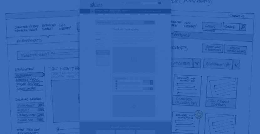
How often do you get stuck on a design problem? For me, it usually happens when we go from the concept of a thing to the first version of the wireframes. Yes, it made some sense to group these 10 things together, but from a design standpoint, we find that the page layout doesn’t work. Maybe there are too many things on the page. Or maybe there are too many DIFFERENT things on the page. Or, maybe, through the process of design, we realize that those things shouldn’t have been grouped together in the first place.
Regardless of the reason, the best way out of these predicaments is not usually forward; it’s backward. Rather than continue to fight the design and try to squeeze everything into the available pixels, maybe you should ask: what can I remove to make this page simpler?
We'd love to partner with you on your next project!
Since we’re big on relationships, we’re all about finding the right fit. Will you take the next step with us to see if we’re a match?


