The Bluespark Design Process - PART 2
If you haven't already, you may want to read Part 1 first.
PART 1: The Art of Sketching before Wireframing. Ok, It’s not really Art!
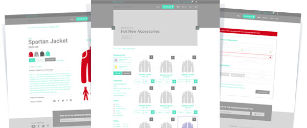
Now that we’ve received feedback and received the go-ahead from our initial rough sketches, we can now move forward with creating hi-fidelity wireframes. Yes… I know what you’re thinking. Usually wireframes are low-fidelity, but we’ve just gone through a series of rough sketches that really gave us the quick and dirty low-fidelity structural elements. Getting buy-in on the sketches has given us the affordance to move forward and explore the structural elements with much more detail from an Information Architecture (IA) point of view.
What Is a Wireframe?

For those of you who are new to the concept of wireframes, let’s discuss what they are and the benefits of including this stage in our Information Architecture/Design process.
A wireframe is a visual representation of a website or applications structural layout. It’s sometimes referred to as the skeleton or blueprint. Wireframes give us the ability to think about content from an IA point of view, the navigational requirements and other site components specific to each project. They also give us the ability to consider interaction requirements.
The wireframe stage is developed in black and white (shades of gray) so we don’t focus on the design elements. We want to ensure we’re building a product that’s going to align user goals with stakeholder objectives.
A wireframe allows us to explore the user Journey before any real creative work begins.
Wireframes will save you time over the course of the project

I’d be lying if I didn’t think this is the most critical step in the development process of any online project (I’m pretty biased).
Back in the day we used to meet with project owners and within a few hours of discovery we were knee deep in photoshop laying out every page in all it’s high-fidelity goodness. Sadly, we learned pretty quickly that that process is a big waste of time because we were focusing our efforts on the wrong goal. We were focused on making a site that looked good not a site that accomplishes a set of stakeholder goals that align with user needs.
Often times what project owners say they want and what they really need don’t align until they can see how the structure, navigation and page elements work together to create a site that is developed to achieve key business objectives.
It’s not their fault. Humans have emotional responses to color, imagery and style. It’s our job as UX practitioners to ensure we’re focusing on the right things at the right stage in the process.
Design elements are a very important part of the design process, but we need to prioritize structural elements, navigational aids and content placement first.
It’s not uncommon to hear a project owner say “We want the site to look clean, be easy-to-use and look nicer than our competitors”. Sadly, this doesn’t tell us a whole lot as these terms mean something different to everyone. In fact, what they’re really after is a site that looks good but meets a series of goals set by their project team.
Wireframing affords us the opportunity to take a step back from the design phase and start to understand what stakeholders really want by thinking about the ultimate challenges from a structural point of view and testing our assumptions before we spend too much time on implementing the design elements.
Wireframing helps focus teams on user and stakeholder goals

Going through the sketching and wireframing stages on a project can feel like it’s adding unnecessary time to a deadline that is often tight. But from experience (and lessons learned), it usually speeds up the process as designers, developers and key project stakeholders are now aligned in a unified understanding of what the actual goals are, how they will be achieved and ultimately what is needed to be developed from an implementation standpoint.
In addition, wireframing pushes usability to the forefront by showcasing page layouts at a structural level. It forces everyone to look objectively at the product’s ease of use, conversion paths, navigation titling and feature placement. Wireframes can point out flaws or areas of concern before they become big, expensive problems.
The following is a list of some of the benefits of wireframing:
-
Wireframes allow for early and iterative feedback from teams for quick modifications
-
Wireframes help align stakeholder goals with user needs
-
Wireframes help project owners focus on the structure and goals of a project instead of design elements such as colors, imagery and font choices
-
Wireframes help you to communicate with development teams
-
Wireframes are quick to uncover concerns that should be explored in further detail
-
Wireframes speed up the design phase by offering designers the structure so they can focus on making the site look great for your users
-
Wireframes bring clarity to your projects, allowing you to work through all the interactions and layout needs
-
Wireframing allows for early testing of users before spending time in the design and development phases
You want to make your design and development team to be happy don’t you?

Once we get buy-in on the wireframes it’s now time to document the interaction requirements to reduce confusion and speed up the design and development phases.
Essentially we’re creating notes that go with each of the wireframes. These notes break down all essential product elements to bring clarity to the project as we move through each of the development stages.
Taking time to document the following items will ensure the entire design and development team are on the same page:
-
Where do buttons link to
-
What happens when a user clicks on an element
-
What are the naming conventions for areas of the pages so everyone is speaking the same language
-
How does search/inputs function
-
How do the animations function/move
-
What areas of the page require personalization
-
How do logins and authentication work (ie. levels of authentication)
-
How are error messages invoked
-
And much more…
The more detail you can add in the interaction stage, the simpler you make things for your development team.
Focused and Strategic without the bad influences
Ultimately, we’re using wireframes to focus teams on aligning key business objectives with the needs of your users. By focusing our efforts on the structure, we’re able to think strategically without being influenced by design elements that evoke emotional responses.
--
Did you like this article?
You may also like PART 1:
The Art of Sketching before Wireframing. Ok, It’s not really Art!
We'd love to partner with you on your next project!
Since we’re big on relationships, we’re all about finding the right fit. Will you take the next step with us to see if we’re a match?


