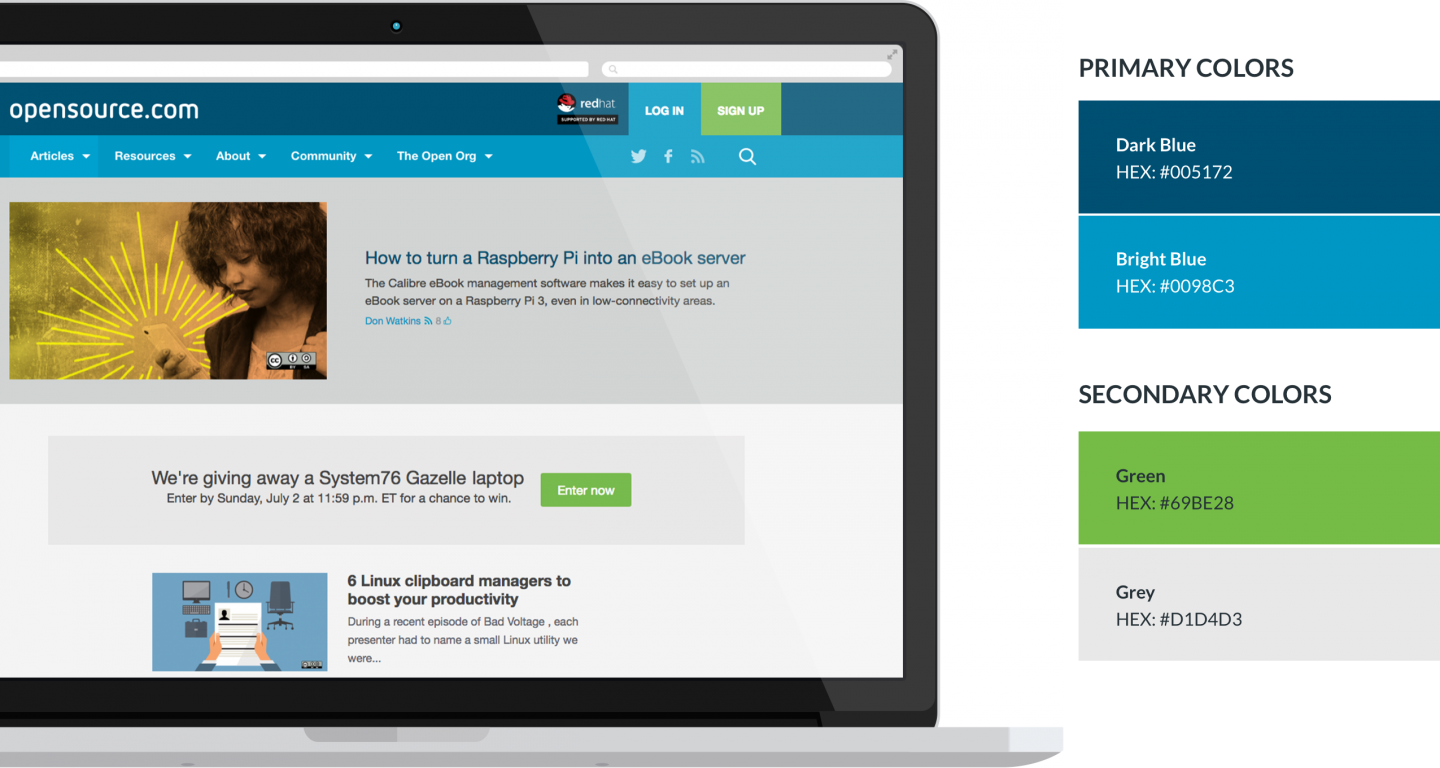
Client Introduction
Opensource.com is a content publishing platform started by Red Hat in 2010. When Red Hat CEO Jim Whitehurst announced the launch of Opensource.com in a blog post, he explained, "This site is one of the ways in which Red Hat gives something back to the open source community. Our desire is to create a connection point for conversations about the broader impact that open source can have — and is having — even beyond the software world."
Strategy
In December 2015, Bluespark started working with Opensource.com on a website redesign and launched the new site in October 2016, less than a year later. Bluespark and Opensource.com laid out clear goals for the project:
- Improve responsive design, mobile friendliness, and user experience by updating the homepage, resource pages, basic pages, and user profiles
- Create new article layout and design for easier reading and increased site stickiness
- Design new homepage layout and design to improve site stickiness
Working alongside the Opensource.com team, Bluespark improved the overall user experience by increasing access to and readability of content. This included, for example, updating user profiles to a single column, full page layout. With a clear focus on SEO, Bluespark also increased the number of Recommended Reading options from three to six, standardized font sizes and body/headlines colors, deleted duplicate content on the homepage, and strategically reduced the amount of content tags from 5,000 to 500.
Along with a more modern design, these strategic updates helped make content more accessible to Opensource.com users.
User Experience
Every decision made, from Day 1 of the project, was focused around driving content and community engagement, which was carefully measured by the Opensource team, in CPMs and CPCs. Therefore, each page layout and design choice stemmed from asking questions like, "Does this help guide the user?" and "Does this help the user find the content they might be looking for?"
Design


Typography
Because it's their wordmark, we speak in Netto OT most of the time. Then Stag Thin Dot offers variety, but shouldn't be overused, like a friend who knows only two magic tricks. In the name of web-friendliness, we used Helvetica - a clean and simple font - to round out the composition.
The Results
With a clear focus on SEO, Bluespark doubled the number of Recommended Reading options, standardized font sizes and colors, deleted duplicate content on the homepage, and strategically reduced the amount of content tags from 5,000 to 500.
Shortly after launch, Call to Action engagement increased by 3 percent, mobile issues were reduced to “zero”, according to Google Webmaster Tools, and more users began accessing content from more places.
Continuous Journey


